📣SCRIPT SALE! Treat yourself to an easier Fall. Save 30% on 5+ perusal scripts with code SPRING30 before May 3 and head into summer stress-free.
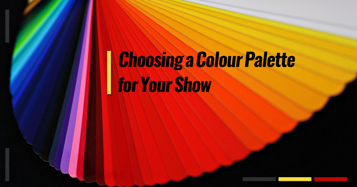
Telling the Story Through Clothing: Choosing a Colour Palette for Your Show
Costumes are such a fantastic way of making the story of a show come alive. Costumes help students really understand and embody their characters. Costumes can also clearly and easily demonstrate the time period of the show – think about the immediately identifiable costume items of the Swinging Sixties (go-go boots, mod mini dresses, wide lapels and trouser legs), the Roaring Twenties (flapper dresses, bobbed hairstyles, cloche hats, and three-piece suits), or the Renaissance (tight bodices, floor-length skirts, muffin hats, and doublets).
Students interested in costume design can take their choices further than just selecting appropriate costume items – they can choose a specific colour palette for their show. A colour palette is a range of colours that are carefully selected and put together. Unless students are doing some sort of a rainbow-themed show, a colour palette will only include particular colours, and particular tones and shades within those selected colours, while excluding other colours, shades, and tones. Colours could be bold, muted, pastel, jewel-tone, dull, bright – or a combination of all of these. It depends on the show itself, and the look and feel that the costume team wishes to present.
The most important concept for students when they are selecting a colour palette is to know WHY they are selecting those specific colours. Ultimately, their choices must support the story being presented onstage.
Here are four ideas to consider when students are selecting costume colour palettes:
1. Historical accuracy
In certain time periods, such as the Renaissance, some colours were reserved for those of royal or noble birth. Purple is generally considered to be a royal colour, as is true red. Peasants and merchants didn’t wear these colours because they simply didn’t have the means to purchase fabrics or dyes in those colours as they were imported from distant countries and tended to be very expensive. Lower-class people generally wore earth-toned fabrics – browns, greens, blues, and so on – as they were much easier to acquire and maintain. In this case, colour is a great way to show class distinctions as well as representing the time period.
2. The mood or emotion the character is intended to evoke
In the Disney/Pixar movie Inside Out, each of the personified emotions has a distinct colour. Joy is sunshine yellow, Sadness is (clearly) blue, Anger is passionate red, Disgust is envious and jealous green, and Fear is light purple – a colour often associated with spooky Halloween. The colour is an easy identifier of each emotion’s primary purpose in Riley’s “head”quarters.
Think of the mood that each character is meant to evoke. A villainous or scary character might typically be dressed in black, green, or purple – think of Severus Snape from the Harry Potter series. A heroic character might dress in a strong jewel tone – think of Spiderman, Captain America, and Wonder Woman in their bold red and blue outfits. A cute character might wear pink, a powerful character might wear red, while a depressed character might wear blue. However, creating a contrast is also an interesting concept. A villain dressed in a pastel costume, such as Dolores Umbridge in her pink wardrobe, or Velma Von Tussle (from Hairspray) in her fancy dresses and perfectly coiffed hair, can be fascinating as well.
3. Showing connections or contrasts between characters or groups of characters
Colour palettes are a simple and clear way to group similar characters together, or show difference between the groups. When I directed The Little Mermaid, the merfolk and under-the-sea creatures were all costumed in bright, bold, glittery costumes in primary colours, while the land folk were dressed in soft pastel colours. This created a fun contrast between the two worlds.
More recently, when I directed Heathers: High School Edition, the character J.D. is known for wearing black jeans, combat boots, and a dark trench coat. However, we went a step further by showing his changing emotional states through the simple t-shirts he wore under his trench coat. In Act 1, he wore a royal blue t-shirt that matched Veronica’s royal blue blazer and plaid mini-skirt, to show their eventual love connection. (Veronica’s parents were also costumed in navy blue, to show their family connection to their daughter.) In Act 2, after having committed many villainous acts, he appears in a red t-shirt, as a contrast to Veronica’s blue.
Costuming similar groups of characters in similar colours is a great way to show connections between families, class distinctions, similar trades or employments, cliques, or friend groups. Think about the signature pink of The Plastics in Mean Girls, or the red and white of the East High Wildcats in High School Musical – these colours bond the characters together.
4. Creating an overall look or concept for the show
Sometimes convention is entirely thrown out the window and shows are costumed in a style that may be anachronistic or stylistically unusual for the time period or subject matter of the show. This is most evident in a show like Chicago where, despite the Jazz Age time period, most productions costume their performers in various modern, tight-fitting dance ensembles – and entirely in black. Everybody – from the Cook County Jail inmates to the members of the press to Roxie and Velma themselves – is dressed in different textures of black lace, mesh, fishnet, spandex, and frills (and despite being entirely the same colour, each fabric looks very different under the stage lights!). Obviously, that is not what prison inmates in the 1920s would actually wear, but it does create a striking look onstage.
I was in a production of Christopher Marlowe’s Edward II, which is set in the 1300s. Rather than costume the show with historical accuracy, the director and costume team selected a sort of space-age, cyber-punk, rock-and-roll look, with all the characters dressed in a palette of black, grey, and silver. Everything, from our costumes to our shoes to our jewelry and makeup were in the black/grey/silver palette, and created a jarring yet memorable effect. Not to mention, it was a lot of fun to wear!
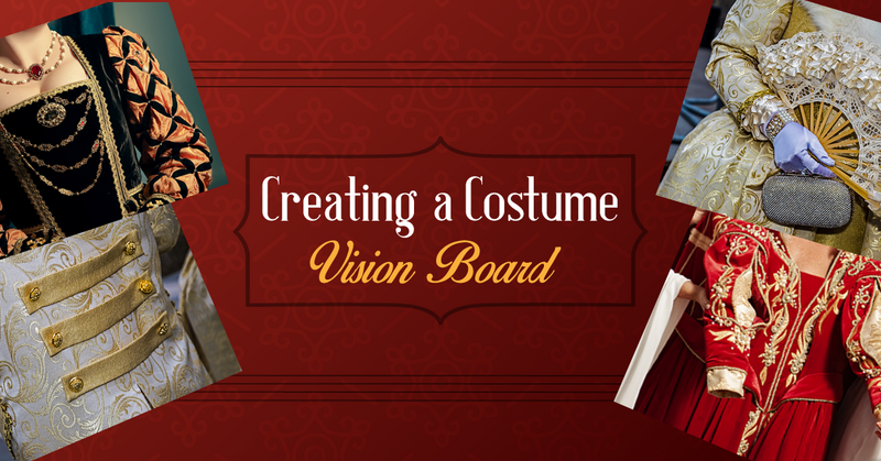
Exercise: Have your students come up with a colour palette for a show you are currently studying in class, or that your school is currently working on. Students will illustrate their colour palette choices using magazine tear-outs, fabric samples, hex colour codes, Pantone colour systems, or another method of their choosing.
Have them reflect on their choices using the provided Reflection sheet. If choosing a colour palette for an entire show is too large a project, have students choose two characters from the show and create colour palettes for those two characters only. Remember, students must be able to explain why they chose those specific colours!
Related Articles


Enjoy a Front Row Seat to Our Newsletter!
Subscribe for our exciting updates, insights, teaching resources, and new script releases. Plus, sign up now and get 4 plays and 2 lesson plans for FREE!